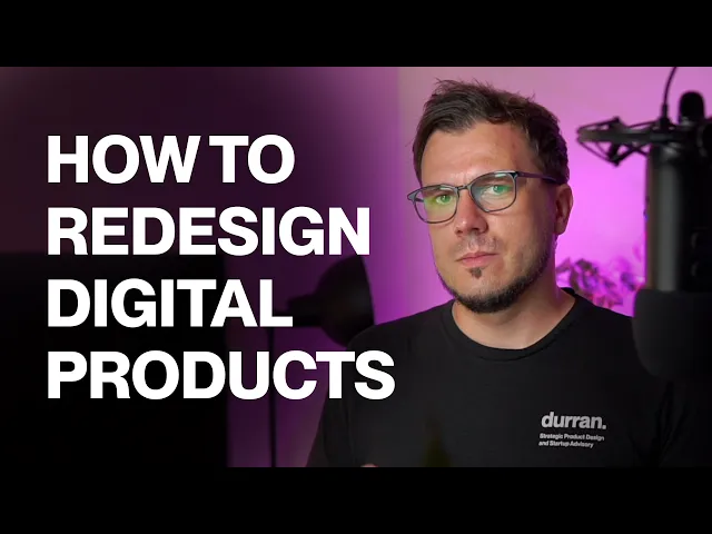
How We Redesigned an EdTech Product to Boost Retention and Onboarding
How We Redesigned an EdTech Product to Boost Retention and Onboarding
How We Redesigned an EdTech Product to Boost Retention and Onboarding
A behind-the-scenes look at redesigning a Romanian edtech platform serving 650 schools and 100,000+ users — and fixing the onboarding that was costing teachers (and the business).
A behind-the-scenes look at redesigning a Romanian edtech platform serving 650 schools and 100,000+ users — and fixing the onboarding that was costing teachers (and the business).
A behind-the-scenes look at redesigning a Romanian edtech platform serving 650 schools and 100,000+ users — and fixing the onboarding that was costing teachers (and the business).

Daniel Andor
Daniel Andor
Daniel Andor
This is the process we used to redesign an edtech product and fix its onboarding. For context: a Romanian edtech company that, at the time, served 650 schools and over 100,000 users. Their challenges were streamlining onboarding for teachers — which was slow and painful — and improving the overall experience for all the key stakeholders: teachers, students, parents, and administrators. We used the same three-milestone process we use today, though it wasn't as well defined back then.
Understand the business and product context
We ran workshops with the product leaders — the founder and product manager — using a stack of exercises to gather as much context as possible: goals, challenges, what the product is, core features, opportunities, stakeholders, and how they monetise. Miro was our playground. We looked at direct and indirect competitors (and, though this was the Romanian market, glanced outside it), built a positioning map and a competitor matrix, and tried several frameworks — SWOT, value proposition, business model canvas. Then we defined the main persona (the teacher) and mapped the customer journey, which made it obvious that onboarding and the first part of using the product was the area to fix. The outcome was a clear overview of the product's strong and weak points, a properly defined persona and journey they didn't have before, and a precise understanding of the customer's biggest struggle.
Create and test solutions
For the next phase we invited more of the company in — marketing, engineering, customer support — for more perspective. We transferred everything from the first workshops to align the whole team on the insights and challenges, set a two-year vision and the obstacles in the way, then revisited the customer journey with all stakeholders added. We researched how other companies — competitors and products from other industries — solve similar challenges, took screenshots and short recordings into Miro, and each person sketched a pen-and-paper concept. From those we defined the key steps and built a prototype (in Sketch, viewed in InVision) and tested it with teachers.
Design the assets for development
The outcome was a validated new design direction. We redesigned the product's look, feel, and flows, and spent real time making sure the onboarding flow worked for teachers — that they understood what to do and had a clear guide through the steps. We simplified onboarding, reorganised the sidebar based on interview feedback, and solved a real edge case: some teachers didn't have email addresses and were creating email accounts for their students just to get them onto the platform, so we found a way to let users in without one. Then we updated the prototype, created the designs, and built a component library — typography, colours, icons, everything — so developers had it all in one place.
This is the work we love: not moving pixels, but understanding the business and the user well enough that the redesign delivers value for both.
See more of our work, or get in touch if your onboarding is costing you.
This is the process we used to redesign an edtech product and fix its onboarding. For context: a Romanian edtech company that, at the time, served 650 schools and over 100,000 users. Their challenges were streamlining onboarding for teachers — which was slow and painful — and improving the overall experience for all the key stakeholders: teachers, students, parents, and administrators. We used the same three-milestone process we use today, though it wasn't as well defined back then.
Understand the business and product context
We ran workshops with the product leaders — the founder and product manager — using a stack of exercises to gather as much context as possible: goals, challenges, what the product is, core features, opportunities, stakeholders, and how they monetise. Miro was our playground. We looked at direct and indirect competitors (and, though this was the Romanian market, glanced outside it), built a positioning map and a competitor matrix, and tried several frameworks — SWOT, value proposition, business model canvas. Then we defined the main persona (the teacher) and mapped the customer journey, which made it obvious that onboarding and the first part of using the product was the area to fix. The outcome was a clear overview of the product's strong and weak points, a properly defined persona and journey they didn't have before, and a precise understanding of the customer's biggest struggle.
Create and test solutions
For the next phase we invited more of the company in — marketing, engineering, customer support — for more perspective. We transferred everything from the first workshops to align the whole team on the insights and challenges, set a two-year vision and the obstacles in the way, then revisited the customer journey with all stakeholders added. We researched how other companies — competitors and products from other industries — solve similar challenges, took screenshots and short recordings into Miro, and each person sketched a pen-and-paper concept. From those we defined the key steps and built a prototype (in Sketch, viewed in InVision) and tested it with teachers.
Design the assets for development
The outcome was a validated new design direction. We redesigned the product's look, feel, and flows, and spent real time making sure the onboarding flow worked for teachers — that they understood what to do and had a clear guide through the steps. We simplified onboarding, reorganised the sidebar based on interview feedback, and solved a real edge case: some teachers didn't have email addresses and were creating email accounts for their students just to get them onto the platform, so we found a way to let users in without one. Then we updated the prototype, created the designs, and built a component library — typography, colours, icons, everything — so developers had it all in one place.
This is the work we love: not moving pixels, but understanding the business and the user well enough that the redesign delivers value for both.
See more of our work, or get in touch if your onboarding is costing you.
Design Process
Product Strategy
Startup
subscribe to our newsletter
subscribe to our newsletter
Get the latest articles straight in your inbox
Get the latest articles straight in your inbox
Practical product and UX insights to help SaaS teams ship with confidence before users get confused or features go unused.
Practical product and UX insights to help SaaS teams ship with confidence before users get confused or features go unused.
Product Design Studio
for growth-stage SaaS teams
© Durran 2026
Product Design Studio
for growth-stage SaaS teams
© Durran 2026
Product Design Studio
for growth-stage SaaS teams
© Durran 2026
Product Design Studio
for growth-stage SaaS teams
© Durran 2026