Butter's Smooth One-minute Onboarding - 4 UX highlights for an Improved Onboarding Experience
Butter's Smooth One-minute Onboarding - 4 UX highlights for an Improved Onboarding Experience
Butter's Smooth One-minute Onboarding - 4 UX highlights for an Improved Onboarding Experience
In a field dominated by Zoom and Google Meet, Butter promises something else – a platform to help facilitators plan and run super-engaging workshops, training sessions, and meetings.
In a field dominated by Zoom and Google Meet, Butter promises something else – a platform to help facilitators plan and run super-engaging workshops, training sessions, and meetings.
In a field dominated by Zoom and Google Meet, Butter promises something else – a platform to help facilitators plan and run super-engaging workshops, training sessions, and meetings.

Daniel Andor
Daniel Andor
Daniel Andor
And the whole product is crafted around this promise. You can see this from the built-in features, such as the agenda planner, toolbox with tools like Miro or Mural, polls, or the fun soundboard and emoticons, and how they present the product.
If you’re a startup founder, product manager, or business owner, stick around to learn about some of the best UX practices Butter implemented for a streamlined onboarding that retains users. Its website is a fine example of fun experimentation and clear messaging, and we’ll outline what Butter did right.
Four best practices will be analyzed, but first, let’s discuss the onboarding process.
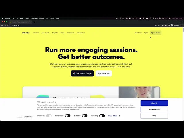
Onboarding flow in just a minute
Here’s a quick walkthrough of Butter focused on the onboarding flow. The aim is to get users in the demo call right at the end.
Onboarding was as smooth as Butter—it took around 1:20 minutes, allowing you to
create your account (signing up with Google or Apple is possible)
agree to ToS and newsletter updates
set up your workspace (name, URL, logo) and other details
enter your own demo room/call
Confirm your e-mail, grant your camera and mic permissions, and start using Butter.
4 UX highlights and best practices
1. Experiment with super fun branding and positioning
The Verge pointed out that websites nowadays are “sterile,” uniform, and lacking personality. In their opinion, this predicament is due to Google’s 2021 Core Web Vital tests and new metrics (AMP format, page experience, mobile-first indexing, etc.), which prompted companies and products to overhaul and redesign their websites to fit Google’s mold.
This push, in turn, resulted in “a flattening and whitewashing of web design across the board,” and its changes “did sort of homogenize the design of the Internet.”
Does this mean product landing pages are doomed to uniformity? Not at all. Here’s how Butter flourishes. With the bright yellow background, the retro UI, and all kinds of neat details here and there popping up, Butter has a personality of its own.
Even the cookies get a fun pun, “Butter cookies,” and loading times—“Churning it up in here.” Depending on the product you’re building, experiment with casual language, rhymes, and elements that reflect your tone and voice.
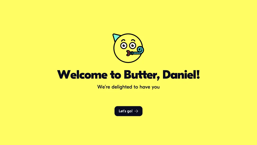
All these build a delightful experience for the users. Aesthetically pleasing designs not only differentiate your brand but also delight users—read this usability heuristics guide.
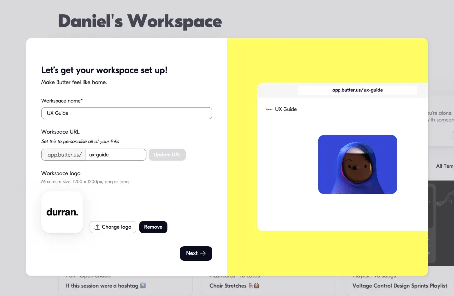
2. Guide the onboarding process
The onboarding flow has a step-by-step approach with clearly defined questions and easy-to-fill-in answers.
It incorporates some neat details, like the workspace setup screen, which previews any changes you fill out in the form.
The only thing missing is a place to show the number of steps, so you know how long the onboarding is. You’d want to include this in your product’s onboarding process.
Once you get through the first part of the onboarding flow—setting up the account—you land in the demo room to experience the value of the product firsthand (the Aha! moment).
3. Convey clear messaging and UVP
Butter positions itself mainly as a Zoom competitor, described antagonistically. See wordings and phrases like “Zoom fatigue,” “It blows Zoom out of the water,” “Butter vs. Zoom,” and “It’s a much better experience for people compared to the corporate blandness of Z**m.”
Butter’s unique value proposition is stated boldly, “With Butter, we help you plan engaging sessions, run them smoothly, and make sure you remember, find, and share everything with recaps.”
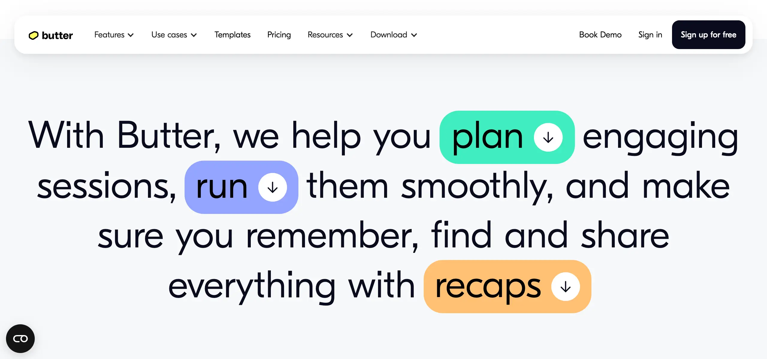
Hover over the three main keywords to get some cute animations of what those pointers entail. Let’s break this UVP down further:
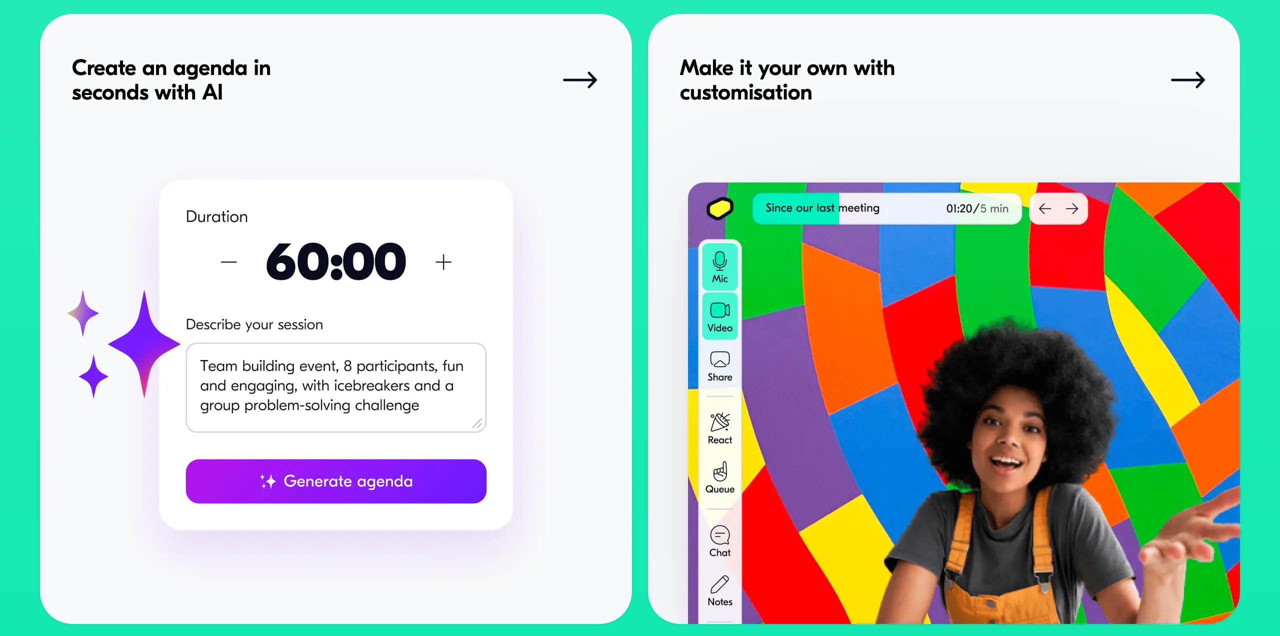
1. Plan. “Butter lets you set up the perfect flow and prepare sessions that practically run themselves.” From AI-powered customized agendas to preloaded tools, this section includes GIFs, carousels, and bright-colored static images to convey the idea of that ‘perfect flow.’
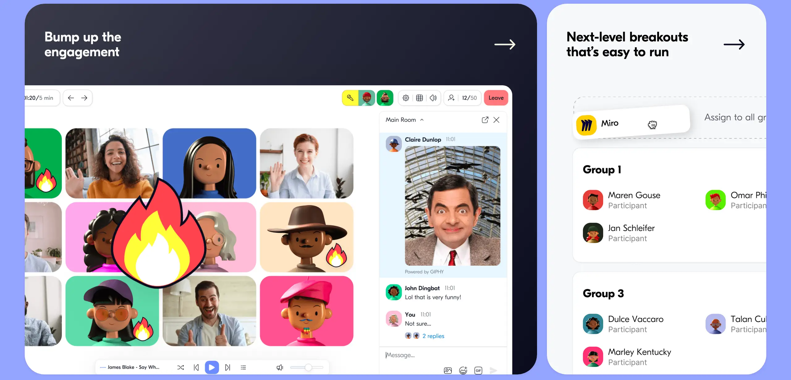
2. Run. “Keep everyone engaged and focused on one window - and one outcome. No other tools required.” Using power words (“bump up the engagement” or “next-level breakouts that’s [sic] easy to run”) atop wide images of jolly avatars and smiley profile pictures, these assets reflect that ‘one-window one-outcome.’
3. Recap. “Butter lets you find, remember, and share outcomes in seconds.” AI has been quite the buzzword, thanks to ChatGPT’s surging popularity since November 2022. Butter doubles down on this AI trend and draws users in with the help of a singled-out purple block opposite a citrus-shade background, meant to create a contrasting effect.
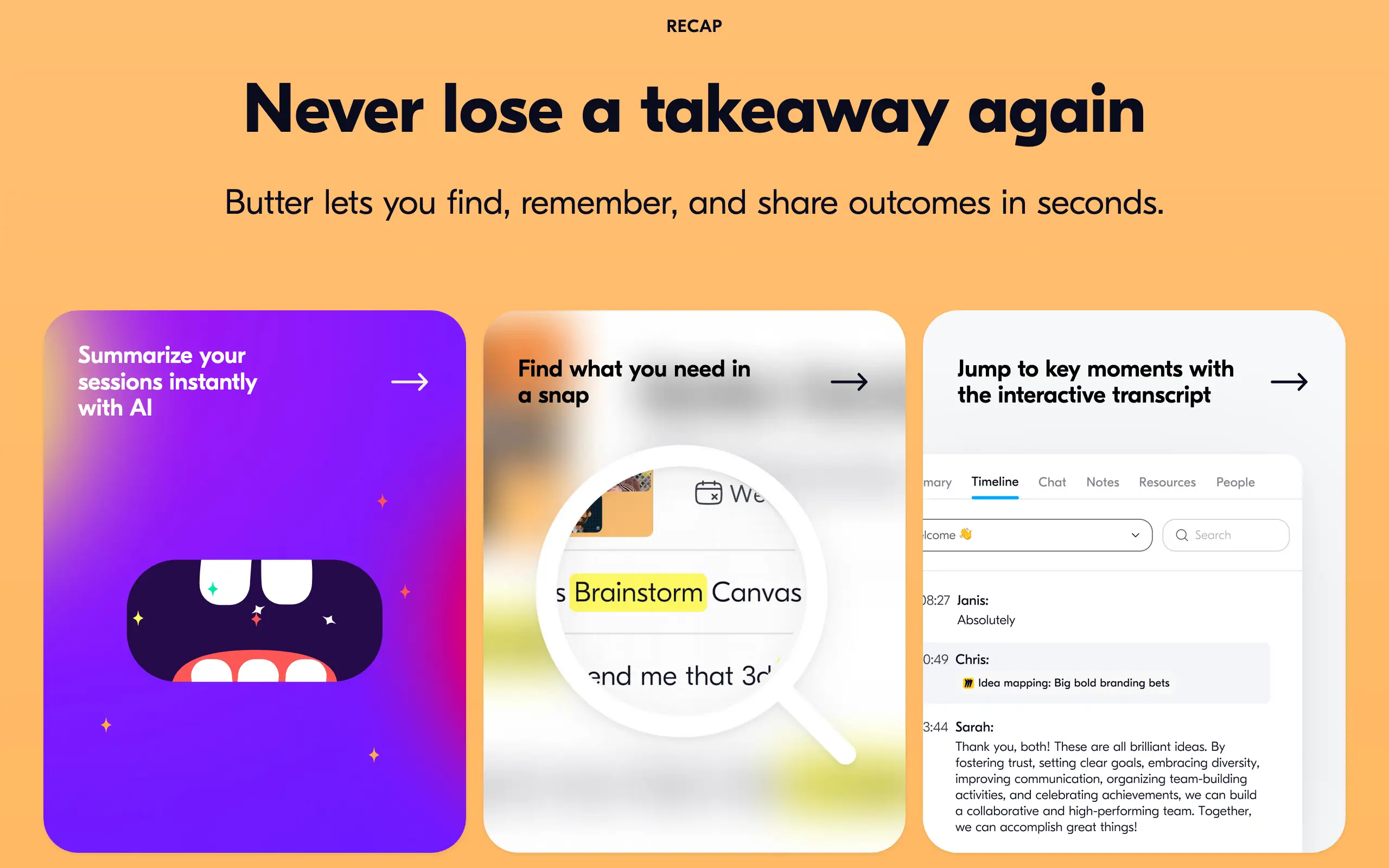
On top of the contrasting effect, Butter also animates the already anthropomorphic AI (represented by the chewing/chugging mouth). Genius.
Don’t forget that there has to be coherence between image and text. A great design intertwines messaging with design elements.
4. Craft your product around the needs of your target customers
Firstly, address the pain points of your target customer. Butter positions itself as an outlier when it comes to traditional communication and videoconferencing tools such as Zoom or Google Meet.
When it comes to meetings, participants often
fail to follow the meeting agenda, causing fatigue and decreased interaction or productivity due to lengthy meetings
experience technical difficulties or have little know-how in using digital tools
forget to take action on what was discussed or established during the meeting
With these insights into the target customer’s main pain points, Butter delivers an easy-to-use AI-powered product with a smooth UX and a great UI.
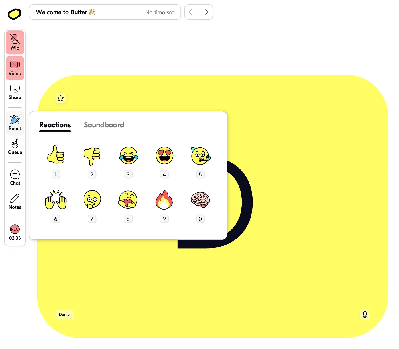
The whole product is built around that, with features that help you have a streamlined workshop (like the toolbox to embed all the tools into the call, so people don’t have to wander around or the agenda) to those that increase the engagement during the call (soundboard, reactions).
Secondly, add value to your target customers via a super benefit. What do I mean by this? Considering that Butter is a videoconferencing tool built for people and around human communication, a super benefit is offering that sense of community and mentoring. Butter does this aptly due to the very nature of the app.
In Butter’s case, the target customers are facilitators, as seen from the product’s positioning and messaging, e.g., “Loved by facilitators everywhere.” In addition to offering a great tool for facilitators, Butter leans on the mentoring and nurturing side and offers a network for experts and novices alike.
Check out Butter Community’s animated title and slogan, “Built for facilitators, by facilitators. Level up your facilitation skills by learning from our network of experts.”

Tip: Be careful not to spread yourself too thin when allocating time and resources to solving target customer pain points. Make sure you and your team are very clear on the design process.
Takeaway
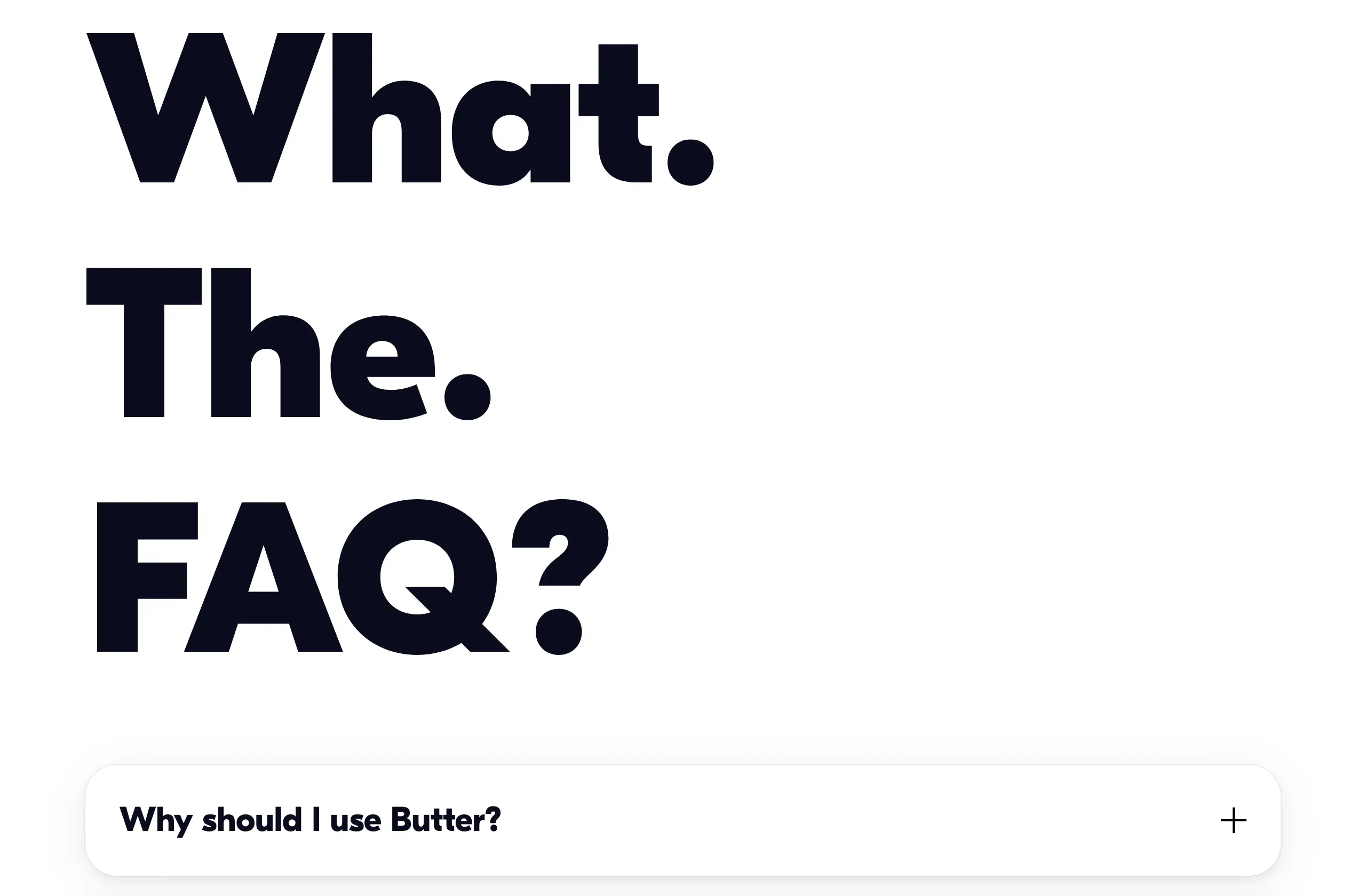
Butter is one of those audacious (see the FAQ section below) and in-your-face yet fun and memorable designs. Though Butter falls short of Google’s Core Web Vital assessment, it definitely delivers a unique user experience. So webmasters out there can rest assured that Butter brightens up the Internet landscape of uniform and bleak designs.
Explore and take notes on Butter’s onboarding process. I’ve created a dedicated Miro board where you’ll find screens for:
the onboarding flow (website, create account, account setup, email verification, demo call)
in-call screens
home/dashboard
settings
‘Create a room”
room settings
emails
Hopefully, you’ll extract some wisdom from Butter and implement it in your own design processes.
If you need help, contact our design studio, Durran, a strategic product design and advisory for ambitious founders.
And the whole product is crafted around this promise. You can see this from the built-in features, such as the agenda planner, toolbox with tools like Miro or Mural, polls, or the fun soundboard and emoticons, and how they present the product.
If you’re a startup founder, product manager, or business owner, stick around to learn about some of the best UX practices Butter implemented for a streamlined onboarding that retains users. Its website is a fine example of fun experimentation and clear messaging, and we’ll outline what Butter did right.
Four best practices will be analyzed, but first, let’s discuss the onboarding process.
Onboarding flow in just a minute
Here’s a quick walkthrough of Butter focused on the onboarding flow. The aim is to get users in the demo call right at the end.
Onboarding was as smooth as Butter—it took around 1:20 minutes, allowing you to
create your account (signing up with Google or Apple is possible)
agree to ToS and newsletter updates
set up your workspace (name, URL, logo) and other details
enter your own demo room/call
Confirm your e-mail, grant your camera and mic permissions, and start using Butter.
4 UX highlights and best practices
1. Experiment with super fun branding and positioning
The Verge pointed out that websites nowadays are “sterile,” uniform, and lacking personality. In their opinion, this predicament is due to Google’s 2021 Core Web Vital tests and new metrics (AMP format, page experience, mobile-first indexing, etc.), which prompted companies and products to overhaul and redesign their websites to fit Google’s mold.
This push, in turn, resulted in “a flattening and whitewashing of web design across the board,” and its changes “did sort of homogenize the design of the Internet.”
Does this mean product landing pages are doomed to uniformity? Not at all. Here’s how Butter flourishes. With the bright yellow background, the retro UI, and all kinds of neat details here and there popping up, Butter has a personality of its own.
Even the cookies get a fun pun, “Butter cookies,” and loading times—“Churning it up in here.” Depending on the product you’re building, experiment with casual language, rhymes, and elements that reflect your tone and voice.
All these build a delightful experience for the users. Aesthetically pleasing designs not only differentiate your brand but also delight users—read this usability heuristics guide.
2. Guide the onboarding process
The onboarding flow has a step-by-step approach with clearly defined questions and easy-to-fill-in answers.
It incorporates some neat details, like the workspace setup screen, which previews any changes you fill out in the form.
The only thing missing is a place to show the number of steps, so you know how long the onboarding is. You’d want to include this in your product’s onboarding process.
Once you get through the first part of the onboarding flow—setting up the account—you land in the demo room to experience the value of the product firsthand (the Aha! moment).
3. Convey clear messaging and UVP
Butter positions itself mainly as a Zoom competitor, described antagonistically. See wordings and phrases like “Zoom fatigue,” “It blows Zoom out of the water,” “Butter vs. Zoom,” and “It’s a much better experience for people compared to the corporate blandness of Z**m.”
Butter’s unique value proposition is stated boldly, “With Butter, we help you plan engaging sessions, run them smoothly, and make sure you remember, find, and share everything with recaps.”
Hover over the three main keywords to get some cute animations of what those pointers entail. Let’s break this UVP down further:
1. Plan. “Butter lets you set up the perfect flow and prepare sessions that practically run themselves.” From AI-powered customized agendas to preloaded tools, this section includes GIFs, carousels, and bright-colored static images to convey the idea of that ‘perfect flow.’
2. Run. “Keep everyone engaged and focused on one window - and one outcome. No other tools required.” Using power words (“bump up the engagement” or “next-level breakouts that’s [sic] easy to run”) atop wide images of jolly avatars and smiley profile pictures, these assets reflect that ‘one-window one-outcome.’
3. Recap. “Butter lets you find, remember, and share outcomes in seconds.” AI has been quite the buzzword, thanks to ChatGPT’s surging popularity since November 2022. Butter doubles down on this AI trend and draws users in with the help of a singled-out purple block opposite a citrus-shade background, meant to create a contrasting effect.
On top of the contrasting effect, Butter also animates the already anthropomorphic AI (represented by the chewing/chugging mouth). Genius.
Don’t forget that there has to be coherence between image and text. A great design intertwines messaging with design elements.
4. Craft your product around the needs of your target customers
Firstly, address the pain points of your target customer. Butter positions itself as an outlier when it comes to traditional communication and videoconferencing tools such as Zoom or Google Meet.
When it comes to meetings, participants often
fail to follow the meeting agenda, causing fatigue and decreased interaction or productivity due to lengthy meetings
experience technical difficulties or have little know-how in using digital tools
forget to take action on what was discussed or established during the meeting
With these insights into the target customer’s main pain points, Butter delivers an easy-to-use AI-powered product with a smooth UX and a great UI.
The whole product is built around that, with features that help you have a streamlined workshop (like the toolbox to embed all the tools into the call, so people don’t have to wander around or the agenda) to those that increase the engagement during the call (soundboard, reactions).
Secondly, add value to your target customers via a super benefit. What do I mean by this? Considering that Butter is a videoconferencing tool built for people and around human communication, a super benefit is offering that sense of community and mentoring. Butter does this aptly due to the very nature of the app.
In Butter’s case, the target customers are facilitators, as seen from the product’s positioning and messaging, e.g., “Loved by facilitators everywhere.” In addition to offering a great tool for facilitators, Butter leans on the mentoring and nurturing side and offers a network for experts and novices alike.
Check out Butter Community’s animated title and slogan, “Built for facilitators, by facilitators. Level up your facilitation skills by learning from our network of experts.”
Tip: Be careful not to spread yourself too thin when allocating time and resources to solving target customer pain points. Make sure you and your team are very clear on the design process.
Takeaway
Butter is one of those audacious (see the FAQ section below) and in-your-face yet fun and memorable designs. Though Butter falls short of Google’s Core Web Vital assessment, it definitely delivers a unique user experience. So webmasters out there can rest assured that Butter brightens up the Internet landscape of uniform and bleak designs.
Explore and take notes on Butter’s onboarding process. I’ve created a dedicated Miro board where you’ll find screens for:
the onboarding flow (website, create account, account setup, email verification, demo call)
in-call screens
home/dashboard
settings
‘Create a room”
room settings
emails
Hopefully, you’ll extract some wisdom from Butter and implement it in your own design processes.
If you need help, contact our design studio, Durran, a strategic product design and advisory for ambitious founders.
Design Process
Product Strategy
Startup
subscribe to our newsletter
subscribe to our newsletter
Get the latest articles straight in your inbox
Get the latest articles straight in your inbox
Practical product and UX insights to help SaaS teams ship with confidence before users get confused or features go unused.
Practical product and UX insights to help SaaS teams ship with confidence before users get confused or features go unused.
Product Design Studio
for growth-stage SaaS teams
© Durran 2026
Product Design Studio
for growth-stage SaaS teams
© Durran 2026
Product Design Studio
for growth-stage SaaS teams
© Durran 2026
Product Design Studio
for growth-stage SaaS teams
© Durran 2026