Miro – Where Successful Onboarding Flows are Born (Here’s How in 3 Steps)
Miro – Where Successful Onboarding Flows are Born (Here’s How in 3 Steps)
Miro – Where Successful Onboarding Flows are Born (Here’s How in 3 Steps)
On a mission to empower teams to create the next big thing, Miro is the go-to whiteboarding tool for workshops of all kinds and remote collaboration.
On a mission to empower teams to create the next big thing, Miro is the go-to whiteboarding tool for workshops of all kinds and remote collaboration.
On a mission to empower teams to create the next big thing, Miro is the go-to whiteboarding tool for workshops of all kinds and remote collaboration.

Daniel Andor
Daniel Andor
Daniel Andor
Formerly known as Realtimeboard, Miro made strides to become the leading visual collaboration platform for distributed teams of any size.
This UX audit analyzes Miro’s onboarding flow, outlining three key insights to improve your product’s activation rate. Whether you’re a startup founder, product manager, or designer, these highlights are worth considering and tinkering on.
It’s worth noting that Miro’s onboarding flow has changed significantly since its growth phase in 2017. Kate Syuma, Miro’s first Product Designer, pinpoints the smart iterations that made Miro’s onboarding process a spectacular success, scaling to 60+ million users in remote work and hybrid landscapes.
Read this detailed presentation of Miro’s user onboarding and activation approach for key learnings during Miro’s three stages of growth, from startup to hyper-growth and scale. In short, successful user activation is done by nailing these three phases: the setup, the aha moment, and habit formation.
In this article, I’ll touch on Miro’s approaches and three key aspects of user onboarding and activation, explaining how Miro did justice to their flow.
3 Key points for a better onboarding process
What’s user activation? First, it’s important to mention that this is not the same as user signup.
User activation consists of three checks which aren't so clearly cut. The three-step process for a successful user activation and long-term retention is the following: (1) the setup moment, (2) the aha moment, and (3) the habit moment.
The setup moment is the first time a user gets in contact with the product, followed by the aha moment when the user experiences the core value proposition—that moment of sudden insight and discovery when the user gets it.
Lastly, the habit moment is when users repeat basic functionalities and task actions around the core value over a period of time. That’s when a user is considered “activated.”
Caveat: quantifying the habit loop’s success is more challenging—basically, if the user continually does the core action, then the user is fully activated.
In a nutshell, successful activation is when you start using a new app, figure out how it works,understand why it's helpful and you are repeatedly coming back to use the product.
1. Wizard vs. progressive disclosure
The entire onboarding flow of Miro took almost 2 minutes, enabling the user to create an account, fill in the required details, and create their first board, all while grasping the basic functionalities of Miro.
But Miro went about with two different approaches:
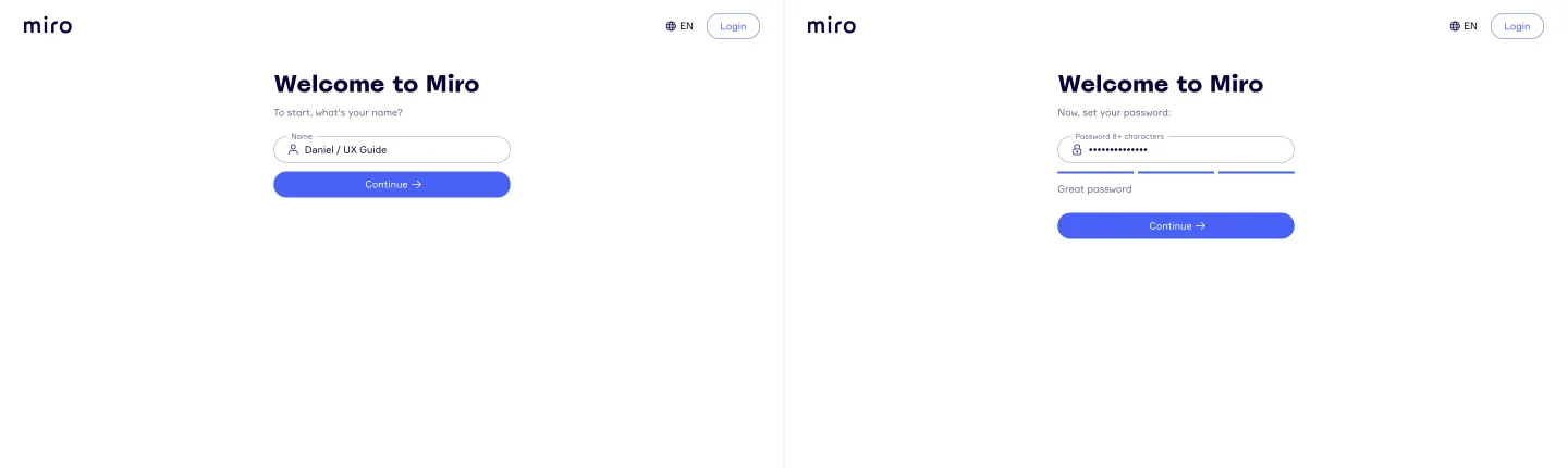
The first part, account creation, uses a wizard approach, with one task per page, making it easy to fill in and move to the next step. This approach reduces friction for the user when first interacting with the product. At this stage, the only downside is the lack of an indicator for the number of steps.
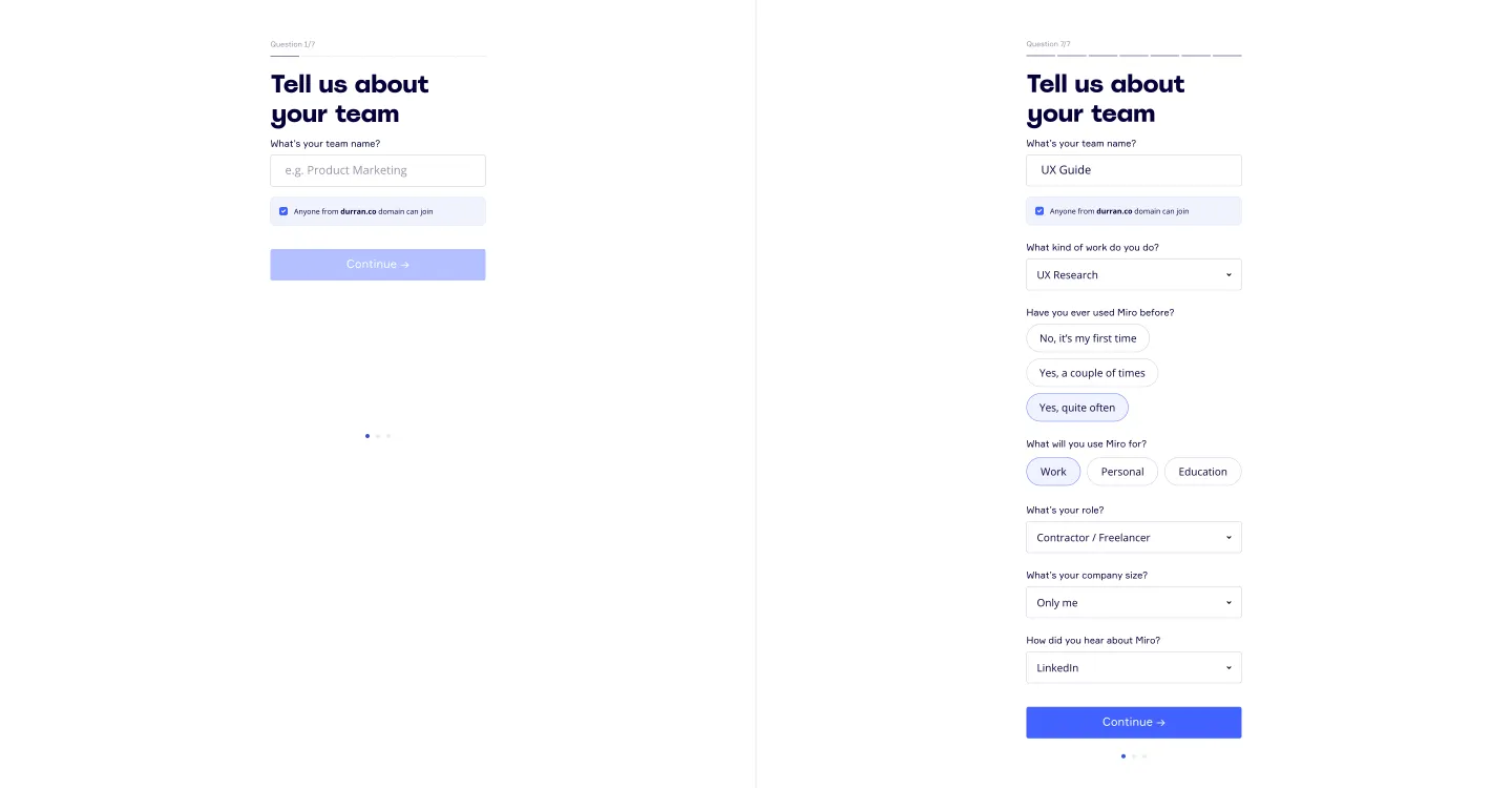
The second part of the flow, account setup, uses progressive disclosure, with each question showing up on the same page once you complete the current step. Miro also added the number of steps at the top, so you know how long the flow will take.
Let's recap what these two approaches are and how you can use them effectively for product design. Both wizard and progressive disclosure aim to improve UX by managing complexity, but they do so in different ways.
The wizard approach is a type of staged disclosure, guiding the user step by step through tasks like software installation or form completion. It's great for complex onboarding because it breaks them down into smaller, easier-to-handle steps, making things smoother for users.
On the flip side, progressive disclosure reveals information bit by bit, depending on what users need.
So, by simplifying the interface and gradually revealing information, you reduce the cognitive load on users (the amount of working memory needed to process info), leading to fewer errors.
Plus, it creates a sense of discovery and accomplishment – users' curiosity is enticed, and they feel engaged in their task.
Tip: First, evaluate which of the two (or both) approaches work best for your onboarding – this is done by understanding your product well. Create a user onboarding flow based on your assumptions; then experiment, A/B test if the time and resources allow, and iterate.
2. Templates to get users started
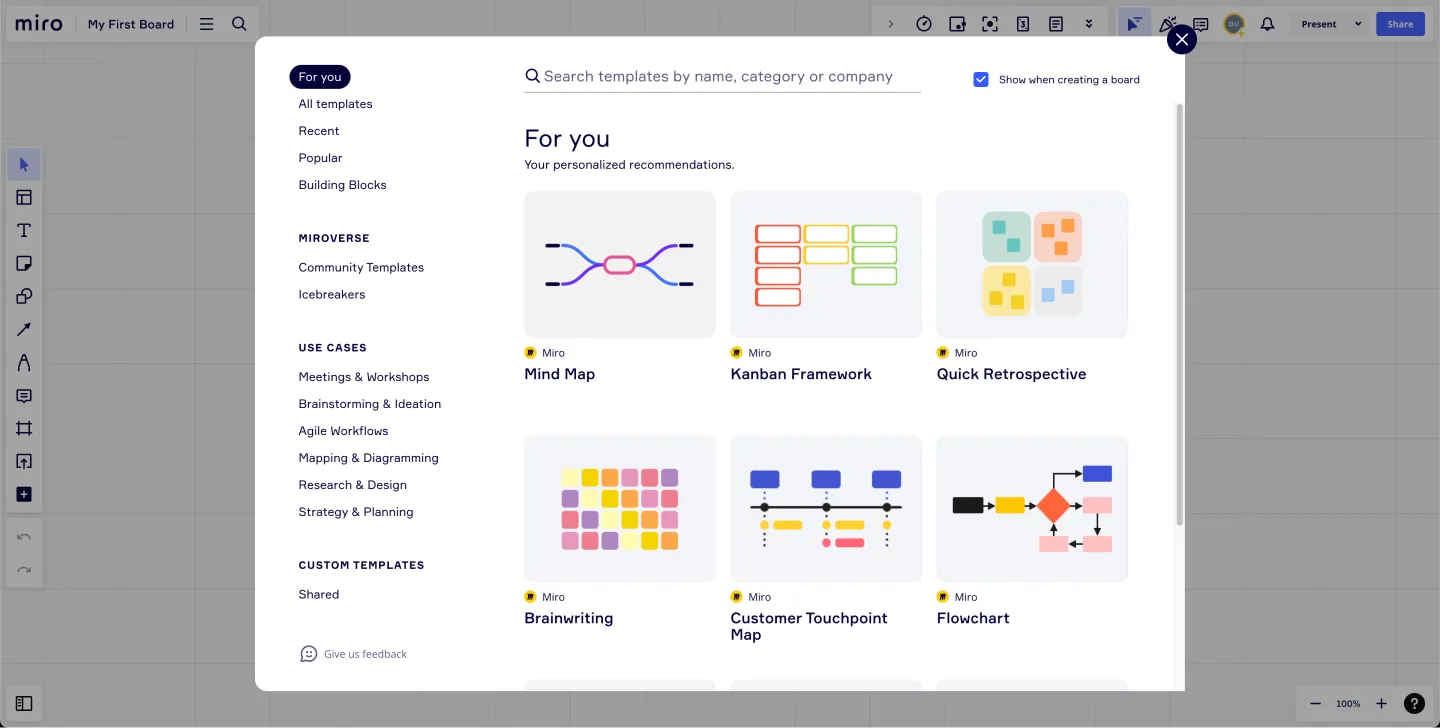
After the setup, users get to explore Miro by browsing a collection of board templates with use cases and recommendations.
The point of templates is to make things fast and easy for the user, especially since Miro is a visual by excellence. With a pre-populated board, users see Miro in action and how its plethora of frameworks and use cases appeal to creatives.
Also, Miro boasts a collection of over 1,000 templates of workflows, projects, and frameworks generated by the Miro community, nurturing that sense of collaboration and community:
Tip: Consider creating templates that showcase the value of your products and, at the same time, streamline the onboarding flow. Templates are the perfect UX-centered content as they are user-friendly, helping improve the experience and expand the product’s use cases. Templates are also a great resource to improve your acquisition efforts.
3. Tasks to showcase basic functionalities

Showcasing users the basic functionality can be pretty dull, to say the least. We talk about things like zoom in, zoom out, or move around. To spice things up, Miro added guidance and success messages. You can hardly go wrong with delightful interactions and compliments like “Nice!” and “Good job!” which, in turn, strengthen habit formation, leading to successful activation.
Just make sure you don’t overdo it. Back in the day, Miro once had way too many UI bling, negatively impacting user experience. The team observed this overwhelm by surveying users about their first experience with Miro:
“We quickly learned that the interactive beautifications of the flow distracted users from completing the main tasks. As a designer, I was awakened from my traditional UI/UX-oriented perspective.”
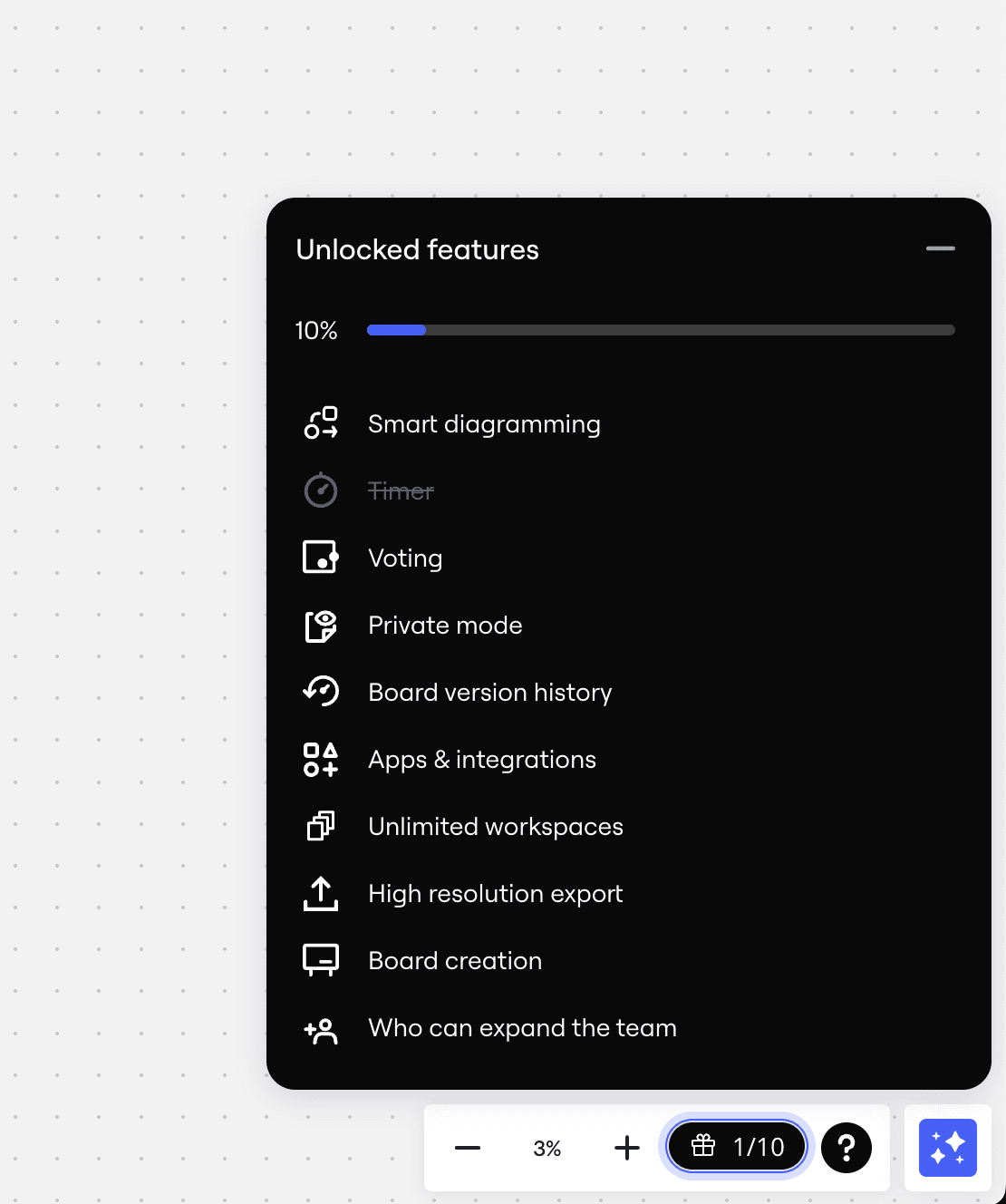
Speaking of task-based approaches, Miro has a checklist of actions that complements the onboarding to help users discover the main features. Checklists come in handy when you want users to get familiar with important tasks and actions. That’s partly due to completion bias – users get a sense of satisfaction when completing tasks. Miro used a percentage progress indicator and a strikethrough checklist as behavioral design cues to trigger completion bias:
Tip: Make sure you have a clean, simple, consistent user interface where users can form habits. Focus on the few core functionalities. The key here is to guide users through the core features and not to overdo it—too much glitter drains user attention and distracts them from your goal.
All the screens
One great takeaway from Miro is how they turned their rebranding process into the perfect PR campaign for using collaborative whiteboards as a remote-hybrid, global enterprise.
So, to restate the fact that Miro is indeed the place where successful onboarding flows are created, you’ll find the following screens in Miro:
the onboarding flow (website, sign up, account setup, email verification, first Miro board creation)
screens with the Miro board section & the actions you can take
boards section/ dashboard
settings & upgrade
emails they send out
If you need help, contact Durran design studio, a strategic product design and advisory for ambitious founders.
Formerly known as Realtimeboard, Miro made strides to become the leading visual collaboration platform for distributed teams of any size.
This UX audit analyzes Miro’s onboarding flow, outlining three key insights to improve your product’s activation rate. Whether you’re a startup founder, product manager, or designer, these highlights are worth considering and tinkering on.
It’s worth noting that Miro’s onboarding flow has changed significantly since its growth phase in 2017. Kate Syuma, Miro’s first Product Designer, pinpoints the smart iterations that made Miro’s onboarding process a spectacular success, scaling to 60+ million users in remote work and hybrid landscapes.
Read this detailed presentation of Miro’s user onboarding and activation approach for key learnings during Miro’s three stages of growth, from startup to hyper-growth and scale. In short, successful user activation is done by nailing these three phases: the setup, the aha moment, and habit formation.
In this article, I’ll touch on Miro’s approaches and three key aspects of user onboarding and activation, explaining how Miro did justice to their flow.
3 Key points for a better onboarding process
What’s user activation? First, it’s important to mention that this is not the same as user signup.
User activation consists of three checks which aren't so clearly cut. The three-step process for a successful user activation and long-term retention is the following: (1) the setup moment, (2) the aha moment, and (3) the habit moment.
The setup moment is the first time a user gets in contact with the product, followed by the aha moment when the user experiences the core value proposition—that moment of sudden insight and discovery when the user gets it.
Lastly, the habit moment is when users repeat basic functionalities and task actions around the core value over a period of time. That’s when a user is considered “activated.”
Caveat: quantifying the habit loop’s success is more challenging—basically, if the user continually does the core action, then the user is fully activated.
In a nutshell, successful activation is when you start using a new app, figure out how it works,understand why it's helpful and you are repeatedly coming back to use the product.
1. Wizard vs. progressive disclosure
The entire onboarding flow of Miro took almost 2 minutes, enabling the user to create an account, fill in the required details, and create their first board, all while grasping the basic functionalities of Miro.
But Miro went about with two different approaches:
The first part, account creation, uses a wizard approach, with one task per page, making it easy to fill in and move to the next step. This approach reduces friction for the user when first interacting with the product. At this stage, the only downside is the lack of an indicator for the number of steps.
The second part of the flow, account setup, uses progressive disclosure, with each question showing up on the same page once you complete the current step. Miro also added the number of steps at the top, so you know how long the flow will take.
Let's recap what these two approaches are and how you can use them effectively for product design. Both wizard and progressive disclosure aim to improve UX by managing complexity, but they do so in different ways.
The wizard approach is a type of staged disclosure, guiding the user step by step through tasks like software installation or form completion. It's great for complex onboarding because it breaks them down into smaller, easier-to-handle steps, making things smoother for users.
On the flip side, progressive disclosure reveals information bit by bit, depending on what users need.
So, by simplifying the interface and gradually revealing information, you reduce the cognitive load on users (the amount of working memory needed to process info), leading to fewer errors.
Plus, it creates a sense of discovery and accomplishment – users' curiosity is enticed, and they feel engaged in their task.
Tip: First, evaluate which of the two (or both) approaches work best for your onboarding – this is done by understanding your product well. Create a user onboarding flow based on your assumptions; then experiment, A/B test if the time and resources allow, and iterate.
2. Templates to get users started
After the setup, users get to explore Miro by browsing a collection of board templates with use cases and recommendations.
The point of templates is to make things fast and easy for the user, especially since Miro is a visual by excellence. With a pre-populated board, users see Miro in action and how its plethora of frameworks and use cases appeal to creatives.
Also, Miro boasts a collection of over 1,000 templates of workflows, projects, and frameworks generated by the Miro community, nurturing that sense of collaboration and community:
Tip: Consider creating templates that showcase the value of your products and, at the same time, streamline the onboarding flow. Templates are the perfect UX-centered content as they are user-friendly, helping improve the experience and expand the product’s use cases. Templates are also a great resource to improve your acquisition efforts.
3. Tasks to showcase basic functionalities
Showcasing users the basic functionality can be pretty dull, to say the least. We talk about things like zoom in, zoom out, or move around. To spice things up, Miro added guidance and success messages. You can hardly go wrong with delightful interactions and compliments like “Nice!” and “Good job!” which, in turn, strengthen habit formation, leading to successful activation.
Just make sure you don’t overdo it. Back in the day, Miro once had way too many UI bling, negatively impacting user experience. The team observed this overwhelm by surveying users about their first experience with Miro:
“We quickly learned that the interactive beautifications of the flow distracted users from completing the main tasks. As a designer, I was awakened from my traditional UI/UX-oriented perspective.”
Speaking of task-based approaches, Miro has a checklist of actions that complements the onboarding to help users discover the main features. Checklists come in handy when you want users to get familiar with important tasks and actions. That’s partly due to completion bias – users get a sense of satisfaction when completing tasks. Miro used a percentage progress indicator and a strikethrough checklist as behavioral design cues to trigger completion bias:
Tip: Make sure you have a clean, simple, consistent user interface where users can form habits. Focus on the few core functionalities. The key here is to guide users through the core features and not to overdo it—too much glitter drains user attention and distracts them from your goal.
All the screens
One great takeaway from Miro is how they turned their rebranding process into the perfect PR campaign for using collaborative whiteboards as a remote-hybrid, global enterprise.
So, to restate the fact that Miro is indeed the place where successful onboarding flows are created, you’ll find the following screens in Miro:
the onboarding flow (website, sign up, account setup, email verification, first Miro board creation)
screens with the Miro board section & the actions you can take
boards section/ dashboard
settings & upgrade
emails they send out
If you need help, contact Durran design studio, a strategic product design and advisory for ambitious founders.
Design Process
Product Strategy
Startup
subscribe to our newsletter
subscribe to our newsletter
Get the latest articles straight in your inbox
Get the latest articles straight in your inbox
Practical product and UX insights to help SaaS teams ship with confidence before users get confused or features go unused.
Practical product and UX insights to help SaaS teams ship with confidence before users get confused or features go unused.
Product Design Studio
for growth-stage SaaS teams
© Durran 2026
Product Design Studio
for growth-stage SaaS teams
© Durran 2026
Product Design Studio
for growth-stage SaaS teams
© Durran 2026
Product Design Studio
for growth-stage SaaS teams
© Durran 2026